
Website Redesign:
Underground Printing
Individual Project: UX Design, UX Research, Content Design, Information Architecture
Duration: 3 weeks
Tools used: Axure
Research Methods: User Interviews, Comparative Usability Study, Cognitive Walkthrough
Overview
Underground Printing is a company where customers can order custom printing apparel and promotional products. During my time working there I held roles that were customer-facing as well as internal business-facing. Comments I often heard from various internal and external stakeholders revolved around the website’s lack of usability. I also spoke to customers who would give up on the process and go to competitors because of this issue.
How might we create a site experience where users can confidently find the accurate information needed to place an order, while also communicating all that Underground Printing has to offer?
What did I assume?
A form to submit questions that the site can’t answer seems like a lazy way out of designing something intuitive.
A website that is less congested and more aesthetically pleasing site would be preferable to use over the current site.
Current display of group ordering options were convoluted and redundant.
No clear paths of how to reach desired information- specifically finding a certain product or a store location.
Not obvious where to go, and steps to take on the site to place a custom order.
My process
The time frame for this project was 3 weeks and did not allow for higher fidelity screens to be made. The scope of this project was not to completely rebuild the website nor to have all new UI.
The main project goals:
Restructure the information architecture for a more seamless user flow.
Trim down content to combat information overload.
Propose new page layouts in the form of a lo-fi clickable prototype using Axure. (I had never used this tool before and was excited for the learning opportunity!)
Research
Content Audit
Screenshot of part of the content audit.
Before diving in to the task of re-designing the information architecture of the site, I evaluated what the current situation of each page of the site was and noted what improvements I thought could be made. I based these suggestions on my experience listening and reading customer complaints about the site during my time at the company. See full content audit here.
I felt that I may have had a skewed mental model of how the site works because I previously worked for this company and know the ins and outs of the website. Therefore, I wanted to make sure I did my initial eval with people who had never used the site before.
Key insights from this initial sitemap evaluation:
Label names in navigation that are long can cause hesitation or confusion
There was hesitation and over pages whose names sounded like they may have the same content
Comparative Usability Study & Cognitive Walkthrough
I chose two companies’ websites that were competitors to UGP to do a comparative usability study alongside with UGP’s site with potential users. I combined this with a cognitive walkthrough for each site. I used the results of this to compare to with my initial assumptions and customer interactions as well as identify any new or surprising pain points.
User Interviews
“You physically cannot be everything to everyone without making things super confusing.”
I knew from my experience, that employees also use the front end of the site when needing to find information for customers so I conducted interviews with 2 current employees of the company. From this, I was better able to see that there was a lot of overlap in pain points between employees and customers and note the most common use cases for the site.

Use Cases
Finding a product in the product catalog.
Finding a store location and contact information.
Finding information about ordering for your group.
Starting a print design for your order.
Getting a price quote for your order.
Now what?
While conducting my research I was able to see that I was incorrect about some of my initial assumptions.
Incorrect assumption:
A form to submit questions that the site can’t answer seems like a lazy way out of designing something intuitive.
What I learned:
Customers actually like having a form to submit their questions and that it makes them feel more confident they are getting the right information that they need for their order.
Incorrect assumption:
A website that is less congested and more aesthetically pleasing site would be preferable to use over the current site.
What I learned:
User: “Although [the competitor]’s site looked good, it actually was not super intuitive.”
Insights
Design Goals
People at the end of the day still will have specific questions that are unable to be answered on the site with information available.
There is a need for catchall form for order specific questions.
Users have difficulty finding specific things that are pertinent to getting an order placed.
Navigation should be set up so that it is intuitive what page you are currently on and where to go next. (I read further into how to do this by studying Jakob Nielsen’s “10 Usability Heuristics for User Interface Design”.)
The amount of information presented to a user at any given time on the site is incredibly overwhelming whether it is visual or text.
The more text there is the more overwhelming it is for the user, therefore their ability to stay on the site and complete what is needed from their visit is dependent on this.
Design
The Treasure (Site)Map
Once I had my design goals laid out, I started the design process by creating a new sitemap where I restructured the global navigation to be more streamlined for the user.
Final Sitemap
Sketching


Because the site had so many pages I wanted to make sure the styles and layout were fluid and consistent. This really helped me to play with what currently existed, what could be added, what could be taken away, and how to best chunk information. This allowed me to envision to user flow of the site before creating the wireframes in Axure.
Content Chunking
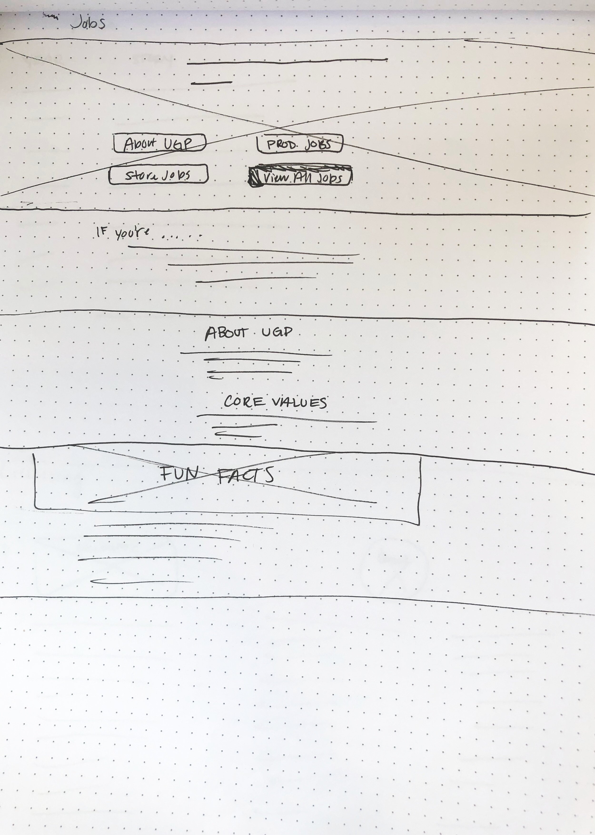
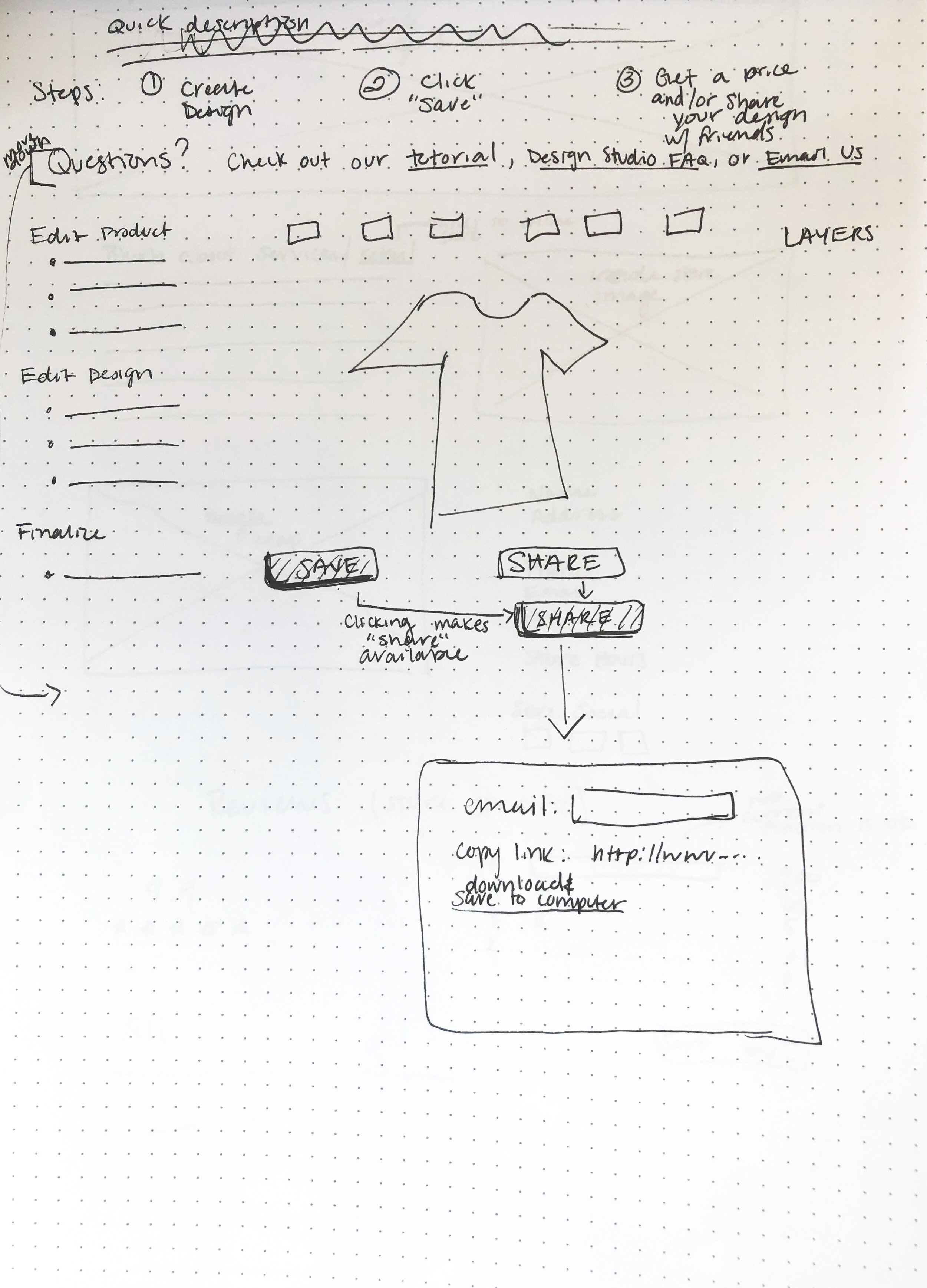
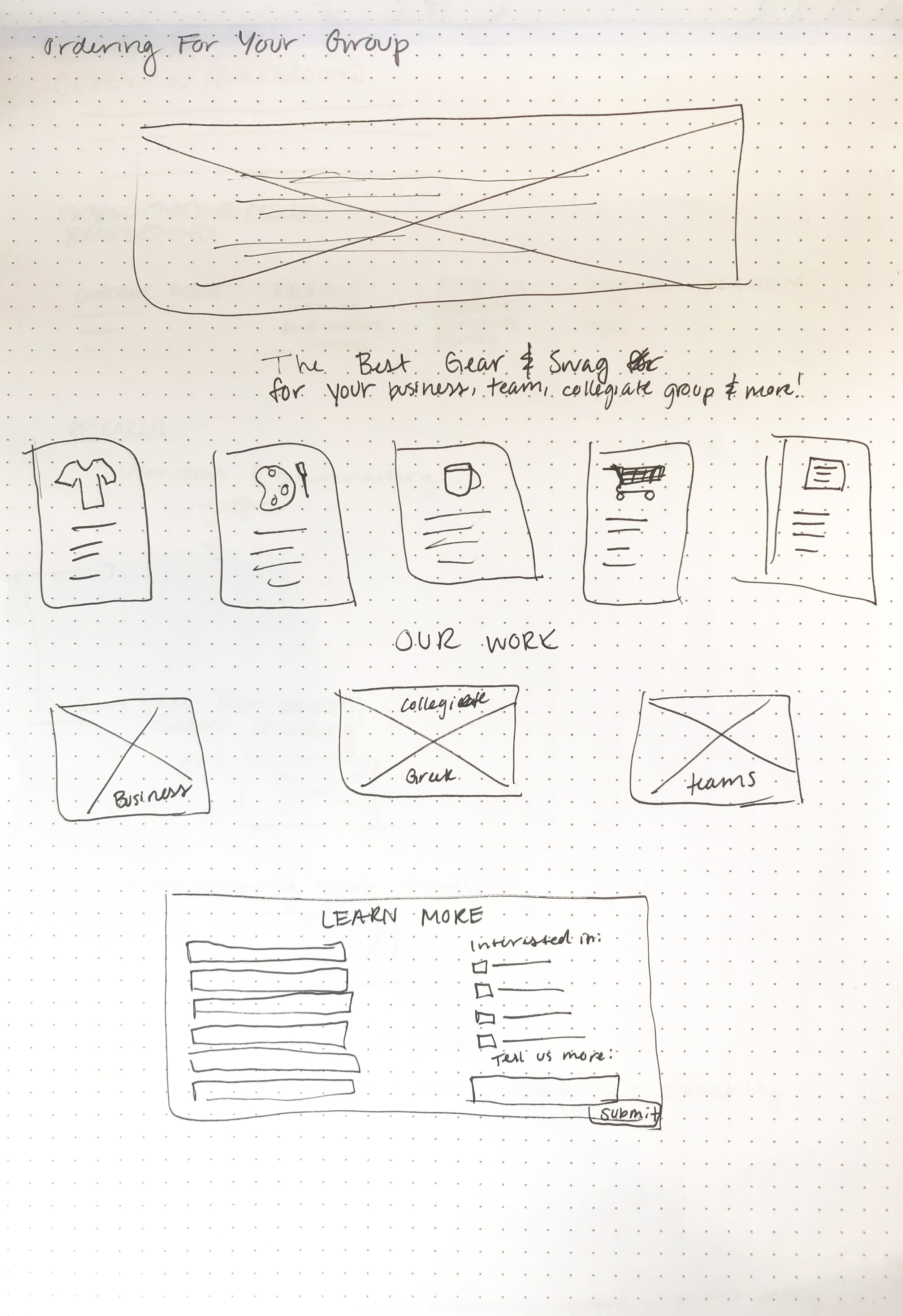
To address the information overload of the current site, I began creating mockups of what each page on the redesigned site would look like with its content “chunked” to be more streamlined and less of an information overload.
Can't Forget About Responsive Design
The scope of my project focused on the desktop version of the site, but after my interviews I realized that a huge part of the site’s usability was it’s lack of responsive design on phones and tablets. I knew I would not be focusing on mobile design for this project, but had not taken into consideration how I should still keep the mobile design in mind while creating the desktop version of the design. As part of my redesign ideation, I created mockups of what a page may look like on different devices and kept this scaling in mind as I moved forward in my redesign of other pages.
From left to right: desktop, tablet, mobile
Prototype
The final deliverable of my project was the suggested page layouts for the site and restructured information architecture. See an example user flow below, and check out my clickable prototype here.
Upon Reflection
Looking back at this project I feel as though I was able to see first hand how creating a good user experience on a site is not as easy as making something “pretty”. This opportunity allowed me to examine the significance of heuristics on a granular level through practice. While practicing this I was able to see how the layout and design of a page can say a lot even with fewer words, and I realized how this can be achieved when you are more intentional in how you place images and text on a page. While doing the redesign, I felt confident in my design decisions after speaking with current and potential users of the site and working to have their voices heard through using my newly acquired knowledge about the practice of information architecture.